


My recent "How We Fish" mural, is made up of close to 700sq ft of stained glass and colored mirror. Its to date the largest amount of stained glass I've added to a wall. To learn more about the project, visit the murals link on this site. Or click here.
This citywide initiative was based around the impact of work on Philadelphia neighborhoods and families. This city was once a major stained glass hub for the country beginning in the early 20th Century. We felt it was important to acknowledge this fact.
The mural is separated into 4 distinct economies. Each section features a major stained glass element. The Merchant Economy storefront has 5 ornate stained glass windows.
Apothecary Window. Since the wall is north facing, a large amount of colored mirror was added to each mosaic piece. The mirror causes the mosaic to constantly shimmer and change appearance throughout the day.
Floral Window
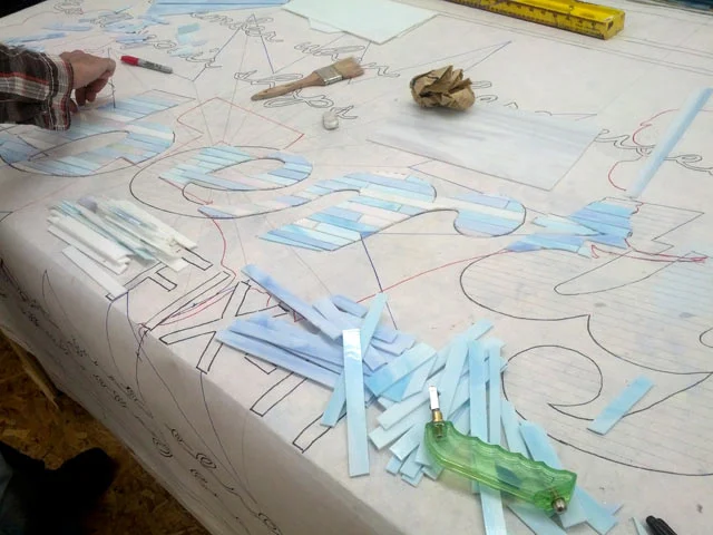
The Industrial economy section features 3 yellow rays, the longest measuring 45 ft in length. Within each ray are images pertaining to shipyard and steel work, The rays are a signature design element of my partners Social Impact Studios.
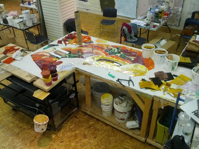
During the summer of 2012 my assistants and I moved my studio into the Mural Arts Program Tour office in the Gallery at Market East. We would spend the next few months fabricating the "How We Fish" mural.
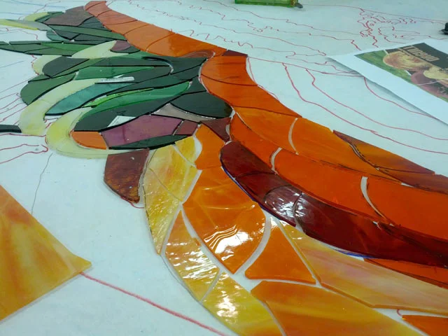
We began our massive endeavor with the tomatoes and mushrooms in a basket featured in the Agricultural Economy section.
Tomato Detail
At this stage there was just two of us working on the glass. The section took about 4 days total to cut and lay out.
We had to plan in advance our use of mirror and iridescent glass. The gills of the mushroom was the perfect spot; The light causes the contrast to shift, depending on the time of day. Here, the brightness wouldn't look out of place.
The close-to-completed piece.
The "Liberty" window in the Merchant Economy section proved to be a challenge. The design featured many seemingly transparent layers on top of one another. We had to carefully choose color values to keep objects at the right distance visually.
To help with the contrast, every element in the window is cut to a specific pattern, enabling it to stand out. The Liberty word is the only piece cut into long narrow strips.
The space for the white decorative border was cut into our background after it was placed. It might seem like an extra step and a waste of time, but it reinforced the illusion of the white being in FRONT of the blue glass.
Lastly, after the window was more or less finished, my assistant Mike cut out the phrase to go on top using my ring saw. A grouping of 3 letters took about 5 minutes each.
The quote came from our initial citywide workshops which were open to the public. "I remember when there used to be repair shops... We didn't just throw away things when they broke."
The finished window laid out on black primed cloth. This gave us an idea how it would look grouted.
Every year for (local theater company) Theatre Exile's fundraiser, I auction off a day with me on a project. Pam, this years winner, got her very own glass window to work on from start to finish. Her name appears in the credits.
The apothecary window, taped up and ready to install.
Henry, one of my three interns that year, begins work cutting out the chain links for the first and largest of the three rays.
The challenge was to be as descriptive as possible while dealing with a limited palette of colors, not very high in contrast.
The rays, a gargantuan undertaking, required 5 people working non-stop 8 hour days for 6 weeks. This ray is 45 feet in length. At this point we had two more to go!
This part of the ray interplays with the painted image of Philly's Global Dye Works factory. The pattern just below is the silhouette of a steel worker. Every figure in the glass is composed of the same pattern.
A ship's propeller in the third ray.
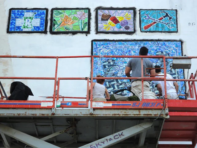
We began installation in late August. Since the wall had been primed to cover an older mural, we had to grind the paint off by hand after marking off where the glass would be.
It took four of us, a total of 3 days to grind everything away.
Grueling work, but worth it in the end. We had a perfect ground to start from, adding just a skim coat of thinset, before the glass.
The vegetables were the first to shine.
The iridescent glass provided a rich color which would seemingly move with the viewer.
Installed ray detail.
My team, installing and cleaning the shop windows, before the grouting.
The Candy Shop window complimented by the blackest grout I could find. The choice in grout color really calls attention to all of our cuts. I don't think I'll ever use a light grout again.
The grout worked even better for the liberty window, with its broad array of cuts and movement. Its so dark the viewer can appreciate the level of detail even from 25ft below.
Window install detail. Photo: Diana Gonzalez
The mirror in the Liberty window reflects an incredible amount of color. Luckily for us, the green goes really well with the piece.
After 4 months of fabrication, the glass took just 6 days to install and grout. To learn more about the project, visit the murals link on this site. Or click here.